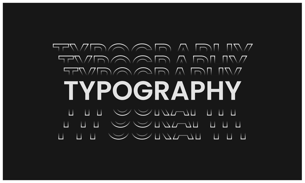
Welcome to the fascinating world of kinetic typography, where words, letters, and sentences are animated and expressive in motion. Have you ever been curious about kinetic typography or how it can turn a text into a captivating visual experience? We will explore the art of animated text and learn the tricks to this interesting approach in this professional guide.
You will learn how kinetic typography gives life to static text, producing a symphony of movement, rhythm, and emotion. You will also learn about its history and contemporary applications. Follow us on an exploration voyage as we discover kinetic typography’s creative potential and how to use it to fascinate and engage audiences like never before.
What is Kinetic Typography?
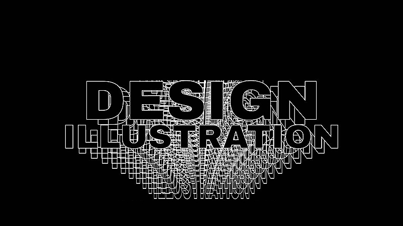
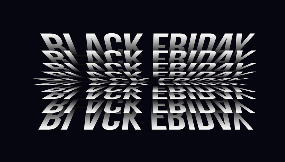
The production of moving type is referred to as kinetic typography. The term refers to shifting text technically. It is a method of video animation that allows users to see text grow, change size, fly, move slowly, and in many other ways.
They appear frequently in movies, ads, music videos, and online classes. The effect may be brief and straightforward with few changes or intricate and protracted. Because kinetic typography is increasingly used in web design, its popularity has recently tripled.
The terms motion typography and fluid typography are frequently used interchangeably.
Motion Typography
Motion typography can be dynamic or scrolling. Text that moves in any direction along a plane, whether sideways, up, down, forward, or backward, is called scrolling motion typography. It is helpful for animated videos that need a lot of text or big words because it may be slowed down and made simpler to keep the viewer’s interest.
When the components of the text in a movie move about one another, that is called dynamic motion typography. In 3D space and on a 2D plane, letters and words can move apart. It’s ideal for videos with fewer words and a more dramatic impact.
Fluid Typography
Any text that moves and is unconstrained by size or direction is said to be using fluid typography. Instead, it is shifting or changing shape in new ways. This gives you creative freedom when creating your moving text and gives your messaging a sense of personality.
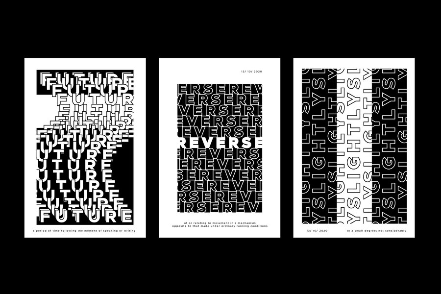
Four Main Types of Typography
You must consider several things while choosing the ideal typeface for your company. To develop brand recognition, your brand typeface must be easy to read. You must also consider the feelings and visuals your logo should evoke.
A good place to start is by being familiar with the four major font categories: Serif, Sans Serif, Display, and Script. Let’s review the fundamentals of each font style and some instances of brands that have used them.
Serif Fonts
The small additional stroke, known as a serif that comes on the letterforms of Serif fonts, can be used to identify them. The extra stroke is a decorative feature that can give serif typefaces a classic, refined look.
Serif typefaces have long been a staple of book and newspaper printing because they have a reputation for being easier to read.
Sans Serif Fonts
Sans serif fonts are devoid of the additional strokes that define serif fonts. Sans serifs can give the impression of being more contemporary, clean, and basic because they lack unnecessary flourishes. Serif fonts are frequently very readable, making them suitable for businesses looking to establish their identity.
Script Fonts
Because script typefaces mimic handwriting, they can give brands a friendly, approachable vibe. Script fonts can convey elegance and dignity because some have more flair than their serif and sans-serif relatives.
The drawback of script typefaces is that they are frequently less readable. Script fonts like Lobster and Allura are examples. The classic Coca-Cola logo is one of the most well-known uses of a script typeface in branding.
Script fonts are a favorite among companies like Instagram and Sharpie that want to show inventiveness. Additionally, some companies that make personal care or food items, like Kellogg’s or Kleenex, utilize script typefaces.
Display Fonts
The most varied fonts are display fonts, commonly called decorative fonts. Display typefaces are designed to stand out and were created for use in large-format displays like advertisements, banners, and headlines.
Serif, sans serif, or script typefaces can all be used for displays. Brands frequently use display fonts to give logos a humorous, playful, or casual feel. Disney, Fanta, Lego, and Baskin-Robbins are a few examples.
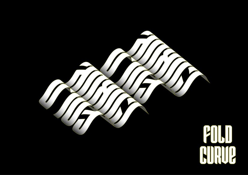
When to Use Kinetic Typography?
It depends, as with any subject of design. Yes, that is the least pleasing response, but it is still correct. There are certain factors to think about. Designers don’t aim to integrate every feature into every program.
Visitors will only be turned away since they won’t get what you’re trying to say if you do this. The main goal of typography is to communicate a message. It’s acceptable to experiment within the confines of your storyline. However, if it gets too complicated, your audience will grow perplexed.
Kinetic typography has shown to be very useful in some applications. Most of these uses are tone-related. This can be accomplished by adding movable type to anything that would otherwise be static. Among the best applications for kinetic typography are:
- Emotional content creation
- Creating characters
- Attention-grabbing
There are certain typical patterns of movement and activity to consider when preparing for kinetic typography.
- Slow motion or fast motion
- Stretching or shrinking
- As the text goes along curved routes, it may move in arcs or waves.
- Action that was anticipated, such a slight motion before a sharp one
- Follow up on actions that are taken after another event has occurred.
- When text moves in response to an event that affects another element in the frame
How to Make Kinetic Typography Videos?
Apart from an electronic device, the first thing you’ll need to start making kinetic typography is some software. Although there are numerous free solutions for starting started, Adobe After Effects is the program of choice for most graphic designers.
The next action that we advise you to take is to read articles and watch tutorials on how to make kinetic typography. Learning the fundamentals of typography and how to employ text in graphic design would also be beneficial.
There are many graphic design and animation classes available that you can take to advance your general skills. There are also many courses specifically geared at the kinetic type that you can take to concentrate on honing this important skill.
What Makes A Good Kinetic Typography?
What distinguishes a great kinetic text animation? Graphic designers can use kinetic or motion typography to create timeless and modern designs. Dynamic motion typography works well when the components of the film text can move in proximity. Additionally, each UI motion needs to be purposeful and justified. This implies that your moving letters, like any other design element, should also aid the user in achieving the desired result and draw attention to it.
The optimal method will involve choosing components like font size, set, typeface, and letter case. Line length, word, letter spacing, and the relative placement of any other included illustrations should all be justified.
Why Use Kinetic Typography?
It Attracts the Readers and Holds the Audience’s Attention
The fundamental strategy for employing typography is picking the right typeface. The font needs to be as tidy as you can make it. It shouldn’t be inadequate and too little. Easy-to-read fonts are important for presentation.
The fonts enhance the quality of your text. It allows readers to comprehend the information in the text. The appropriate font, color, and size selections could captivate your target audience.
Typography makes it simple to catch readers’ attention, but doing so demands more originality. You might try to make the information more interesting by emphasizing interesting texts.
Every material could include some uninteresting text. Typography may make things look appealing if done correctly. Using some eye-catching images can be the best strategy.
It Conveys a Certain Mood or Feeling
An advertisement for a video game could be considered content. It might have some fun game elements in it. You should create glitzy, playful, and entertaining material in this situation.
You should select straightforward, plain, and professional typefaces if your subject calls for some seriousness. How well the content is comprehended depends on the typeface selection.
It Reflects Professionalism
A design project’s effective use of typography conveys high professionalism. Customers become more trustworthy when text is used in the right font and size. If your website is based on business, this will help you market what you sell.
Typography is a fundamental component of the professional design process. Typography draws attention to the importance of the information you provide, assuring clients of the knowledge they have learned.
Few Best Kinetic Typography Examples
Jump (Ford F-150)
You wouldn’t often expect to see dynamic typography in-car advertising. However, the language tells the story in this Ford F-150 video. Ford appears conscious that thirty seconds isn’t enough time to create an impression because the film opens with the words “OK, LOOK…”
The rest of the video maintains this straightforward tone, which draws viewers’ attention. Ford creates a fascinating film that communicates its point by using big, bold language to complement a big, bold car!
Husbands: Dream
Husbands: Dream music video does a nice job utilizing the dark background and the kinetic typography. The words are highlighted by employing bold lettering and a modern black background for the music. The innovative method of presenting text inside individual boxes is the work of Cauboyz.
The animation in the video was created coolly by the animator, perfectly reflecting the song’s tone.
Rick and Morty
What could be better than a scene from your favorite TV program using kinetic typography? Rick and Morty, created by motion graphics designer Gary Motion, adds visuals to a classic comedic TV scene while still being flamboyant and quick-moving.
It’s a very polished piece with some wonderful details, including the text that slides diagonally and the different styles and color choices.
Fusion Design
Fusion Design film is a wonderful illustration of using kinetic typography and motion graphics to make a captivating video. You would like to watch the video’s artistic work and enjoy the included music.
Dusan Tatalovic combines stunning animation, an engaging soundtrack, and amazing text movements to make the viewer want to watch the video all the way through. You can borrow some concepts from this work to make a music video.
Welcome The Video Animation In The Age Of Kinetic Typography
The key to communication is language. It can also be utilized as an aesthetic tool to further emphasize the point in interesting ways, much like any other design tool. As more individuals have access to trade secrets because of technology, the bar keeps going up in the ongoing struggle to capture people’s imaginations.
The appeal of the kinetic type is that it can be used in any project, whether it’s a straightforward implementation or a complicated and captivating design. It will surely leave its mark if it supports the project’s general direction.
Are you considering incorporating kinetic typography, in particular, into your animated motion graphics for marketing purposes? Waiting could cause you to lose a chance. Try expert 2D Animation services and 3D Animation Services to create original videos with kinetic typography.


